
The form comes back with one box empty. You find out a week later, when the file is being closed and someone asks where the emergency contact went. Now you are phoning a client to ask something you could have asked while they sat in front of you.
Fields do not get skipped because people are careless. They get skipped because a PDF on a tablet is a scrolling image. Nothing enforces an order, and nothing tells you which boxes matter. A field halfway down page two is invisible until someone scrolls to it, so you hand the device over and the client fills in what they happen to see. The fix is to stop asking anyone to find the fields at all.
Let the form drive, not the scroll
Tap the first field and a panel opens along the bottom of the screen. It shows which field you are on, takes the answer, and moves to the next incomplete one by itself. The client never scrolls looking for what is left, because the next question comes to them.
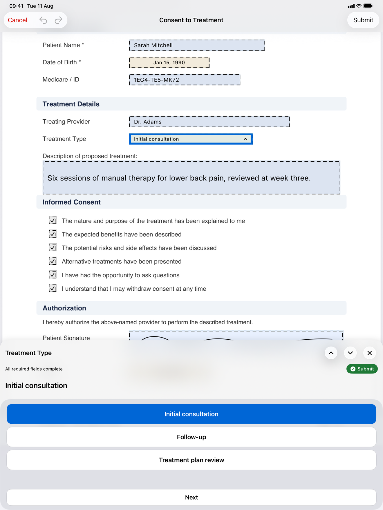
Typing echoes onto the page as you go, so the client watches the answer land in the box on the form, not just in the panel. The active field also gets a blue ring on the page, so there is never a question about which box the panel is asking about.
You can still tap any field on the page directly. That moves the session onto that field, which matters when a client says “wait, go back to the date of birth”. For checkboxes and radio buttons, a direct tap answers the question and moves on in the same gesture.
Choice questions should not summon a keyboard
Most intake questions do not need typing. They are one of four options, or a yes/no, or a date. Making someone use a keyboard for those is what turns a quick form into a slow one.
Radio buttons, checkboxes, dropdowns, and dates get large tappable controls drawn in the space the keyboard would take up. The answer area stays the same height whichever field type you land on, so the layout never jumps around underneath a client’s thumb. After you pick an option the panel pauses for a beat, long enough to see the selection register, then moves on.
Some controls cannot know when you are finished: a date wheel, or a dropdown where you might pick three things. Those wait for you to tap Next. Signature and initials fields open the drawing pad, and tapping Done there advances too.
Required and optional, told apart
A form with fifteen fields where four actually matter needs to say which four. Otherwise you either chase every blank or you chase none.
Required fields are labeled Required in the panel header, and the panel keeps a running count of how many are still empty. Optional fields are not hidden or auto-skipped, because a field nobody visits is a field nobody knows about. Instead each one gets a skip button right next to the answer, so passing on it is one tap and a deliberate choice.
The Submit step at the end of the run appears only once nothing is left incomplete. You do not have to walk the optional fields to reach it, though: as soon as every required field is answered, a green Submit chip shows up in the panel’s progress row, and tapping it goes straight to the end. Fill what matters, submit, and leave the rest blank on purpose.
PDF import sometimes generates field names like text_field_k3x9. The panel shows the field type instead of that raw identifier, so nobody has to interpret a machine name while a client waits.
Undo, so a wrong tap is not a restart
People go slowly with a client’s paperwork because mistakes are expensive to fix. Tap the wrong radio button on a paper-style PDF and you are hunting for the way back.
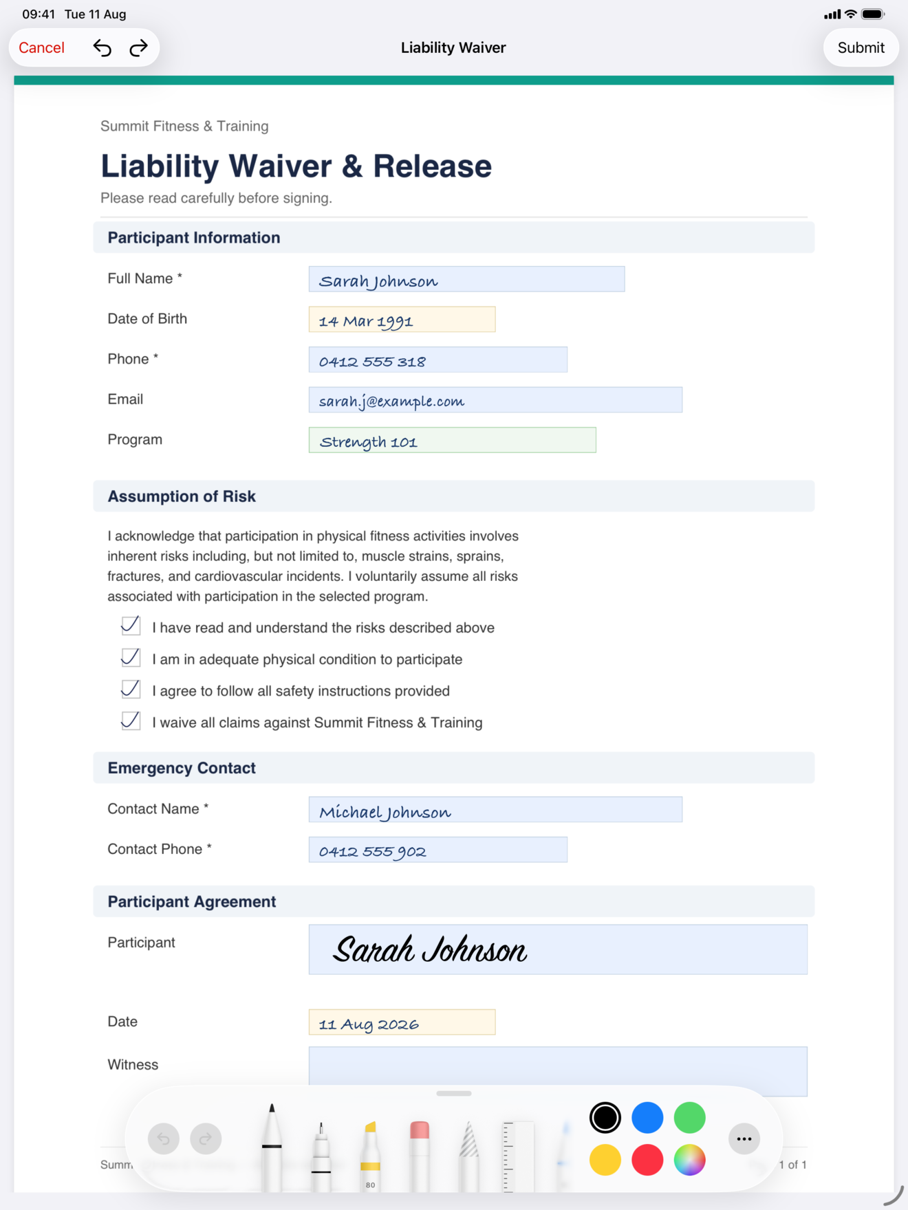
Undo and redo cover the three places an edit can go wrong: placing fields on a template, filling a form by typing, and writing on a form by hand. In the field editor each drag, resize, or delete is one step, so an accidental drag off the page is one undo away rather than a re-place from scratch.
While filling, a run of typing collapses into a single step. Undo once and the answer is gone, rather than one character per press. Spinning a date wheel behaves the same way. On a handwriting form, undo takes back the last stroke.
One edge to know about: undoing an auto-detect removes the fields it just placed, but it does not restore the PDF’s own embedded form widgets. If you want to try detection twice on the same PDF, re-import it rather than undoing.
The short version
Blank fields are a workflow problem, not an attention problem. Take the scroll out of it. Mark what is required and count it down, give optional fields a visible skip instead of hiding them, draw choice controls big enough to tap, and make a wrong answer one undo away so nobody slows down to avoid mistakes. All of it works offline, on the free tier, on iPhone and iPad.
InPersonForms is on the App Store for iPhone and iPad.